Tech Startup Product Designer
It feels good to join something great. But to then make it even better— that impact is what drives me.
I joined Canopy Ed— an early-stage startup with a capital E— in January 2023. It was already a platform people loved to use. The simple design was pleasing. The solution of many tools packed into one interface was what people needed.
But I got to come in with fresh eyes and help make it even better.
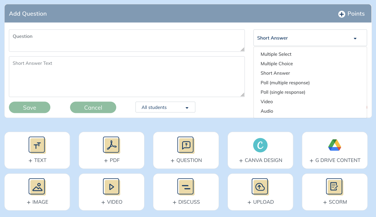
Below is a screenshot of the interface in January. We had a dropdown to choose your question type with 7 options.
[I also do custom builds for enterprise partners— including data collection, user flows, wireframes, and clickable prototypes for learning management and e-commerce options with data dashboards— but NDAs.]


Two New Product Features in my first two weeks
➜ We wanted to add two new interactive question types— matching and sorting. I got to dive right in and design these two new features in my first two weeks at the company.
➜ With 9 question types now, we also wanted to move away from the dropdown. I decided to add visual tiles with icons that would provide a preview of the question-type format.
The top image shows the instructor building a matching question. It also shows the question-type tiles I designed to replace the dropdown selection.
The bottom image shows the instructor’s preview of the learner’s view for a sorting question.
For each of these three projects, I wanted to adhere to the platform’s simplistic design. I was purposeful in my use of color- utilizing the brand’s neutral blues the most. I used the gold as a highlight to draw the eye to the selected question-type. I also wanted plenty of feedback embedded throughout the processes to guide the users and show them what they were doing worked.
I custom-made the 9 icons for the question-type tiles in Figma. Due to the small size, they needed to be simple, but I also wanted them to display a functional preview of the format of the question.
On top of creating the wireframes for both the instructor and learner experiences, I also wrote all directions for the engineering team for the build.
Let’s get quizzical!
Next up— a quiz feature. I got to tap into my teacher brain for this.
What is important to teachers? What would make the quiz most functional for learners and build on best practices, especially for diverse populations with legal accommodations?
For teachers, autograded was a must. I also wanted this to be one screen so they could easily see the questions they’d already added without having to click through multiple screens.
For learners, a common student accommodation is chunked material. What is best for those diverse learners is also often best for all learners. So I wanted only one question to be viewed at once.
See it in action
The videos show it all in action. To the left— the instructor experience. To the right— the learner experience.
